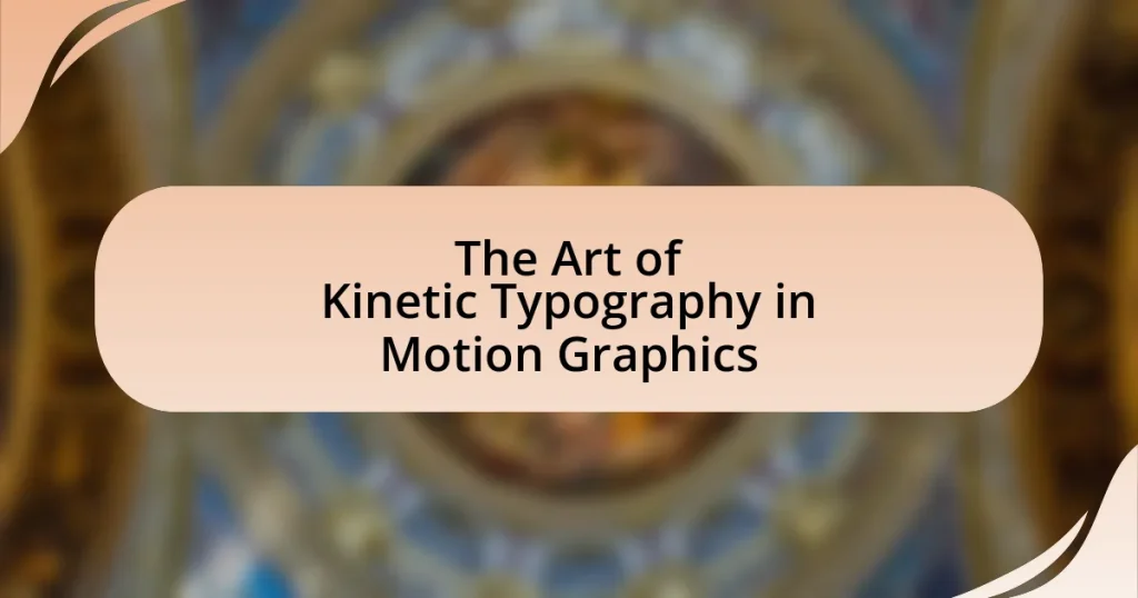
The article focuses on the art of kinetic typography in motion graphics, which involves the dynamic presentation of text through movement to convey meaning and emotion. It explores how kinetic typography enhances visual communication by improving information retention and engagement, emphasizing key elements such as movement, timing, and visual hierarchy. The article also discusses various techniques, styles, and software tools used in kinetic typography, as well as the challenges designers face and best practices for creating effective animations. Additionally, it highlights the importance of clarity, readability, and emotional resonance in the design process to ensure impactful visual narratives.
What is the Art of Kinetic Typography in Motion Graphics?
The art of kinetic typography in motion graphics involves the dynamic presentation of text to convey meaning and emotion through movement. This technique combines typography with animation, allowing words to move in ways that enhance their message, such as changing speed, direction, and style. Kinetic typography is often used in film, advertising, and digital media to engage viewers and create a more immersive experience. Its effectiveness is supported by studies showing that animated text can improve retention and comprehension, making it a powerful tool in visual communication.
How does kinetic typography enhance motion graphics?
Kinetic typography enhances motion graphics by integrating animated text that conveys meaning and emotion, making the visual experience more engaging. This technique allows for dynamic storytelling, as the movement and style of the text can emphasize key messages and evoke specific feelings. For instance, studies have shown that animated text can improve information retention by up to 50% compared to static text, as it captures viewers’ attention and aids in comprehension. By combining typography with motion, creators can effectively communicate complex ideas in a visually appealing manner, thereby enriching the overall impact of the motion graphics.
What are the key elements of kinetic typography?
The key elements of kinetic typography include movement, timing, and visual hierarchy. Movement refers to the dynamic motion of text, which can enhance storytelling and engage viewers. Timing involves the synchronization of text movement with audio or visual elements, creating a cohesive experience. Visual hierarchy emphasizes the importance of font size, color, and placement to guide the viewer’s attention and convey meaning effectively. These elements work together to create an impactful and engaging visual narrative in motion graphics.
How does movement influence the perception of text?
Movement significantly influences the perception of text by enhancing engagement and comprehension. When text is animated or presented with motion, it captures attention more effectively than static text, leading to improved retention of information. Research indicates that dynamic text can facilitate better understanding by providing visual cues that guide the viewer’s focus, as demonstrated in studies on cognitive load and visual processing. For instance, a study published in the journal “Computers & Education” by Mayer and Moreno (2003) found that students who viewed animated text performed better on comprehension tests compared to those who viewed static text. This evidence supports the notion that movement not only attracts attention but also aids in the cognitive processing of textual information.
Why is kinetic typography important in modern design?
Kinetic typography is important in modern design because it enhances visual communication by combining text with motion to convey messages more effectively. This dynamic approach captures attention and engages viewers, making information more memorable. Studies show that incorporating movement in typography can increase retention rates by up to 80%, as it stimulates both visual and cognitive processing. Additionally, kinetic typography allows for greater emotional expression, enabling designers to align the tone of the text with the intended message, thereby improving audience connection and response.
What role does kinetic typography play in storytelling?
Kinetic typography enhances storytelling by visually representing text in a dynamic manner that captures attention and conveys emotion. This technique allows for the synchronization of text movement with audio elements, creating a more immersive experience for the audience. Research indicates that visual stimuli, such as animated text, can improve information retention by up to 65% compared to static text, as demonstrated in studies on multimedia learning by Richard Mayer. Thus, kinetic typography not only engages viewers but also reinforces narrative elements, making the storytelling process more effective and memorable.
How does kinetic typography engage audiences differently than static text?
Kinetic typography engages audiences differently than static text by incorporating movement and animation, which enhances visual interest and emotional impact. This dynamic presentation captures attention more effectively, as studies show that moving elements can increase viewer retention and comprehension by up to 80% compared to static text. The combination of motion, timing, and typography creates a multisensory experience that stimulates cognitive processing, making the content more memorable and engaging.
What techniques are used in kinetic typography?
Kinetic typography employs various techniques, including animation, timing, and spatial manipulation of text. Animation techniques involve the movement of text elements, such as sliding, fading, or rotating, to create visual interest and emphasize meaning. Timing refers to the synchronization of text movement with audio or visual elements, enhancing the overall impact of the message. Spatial manipulation involves altering the position, scale, and orientation of text to guide the viewer’s attention and convey emotions effectively. These techniques are essential for creating engaging and dynamic visual narratives in motion graphics.
How do animators create effective kinetic typography?
Animators create effective kinetic typography by combining text movement with visual storytelling to enhance message delivery. They achieve this through techniques such as timing, rhythm, and synchronization with audio elements, ensuring that the text’s motion aligns with the narrative’s emotional tone. For instance, research indicates that well-timed animations can increase viewer retention by up to 80%, demonstrating the importance of pacing in kinetic typography. Additionally, animators utilize principles of design, such as contrast and hierarchy, to guide the viewer’s attention and emphasize key messages, further reinforcing the effectiveness of the typography in conveying information.
What software tools are commonly used for kinetic typography?
Commonly used software tools for kinetic typography include Adobe After Effects, Apple Motion, and Blender. Adobe After Effects is widely recognized for its robust animation capabilities and extensive plugin support, making it a preferred choice among motion graphic designers. Apple Motion offers a user-friendly interface and seamless integration with Final Cut Pro, appealing to users in the Apple ecosystem. Blender, being an open-source 3D creation suite, provides powerful animation tools that can be utilized for kinetic typography projects, especially for those looking for a cost-effective solution. These tools are essential in the field of motion graphics, enabling designers to create dynamic and engaging text animations.
How do timing and rhythm affect kinetic typography animations?
Timing and rhythm are crucial elements that significantly influence kinetic typography animations by dictating the pace and flow of text movement. Effective timing ensures that the text appears and disappears in sync with audio cues, enhancing viewer engagement and comprehension. Rhythm, on the other hand, establishes a pattern that guides the viewer’s eye, creating a cohesive visual experience. Research indicates that animations that align closely with the rhythm of accompanying sound can improve retention and understanding of the message, as demonstrated in studies on multimedia learning, such as those by Mayer and Moreno, which highlight the importance of temporal alignment in enhancing cognitive processing.
What styles of kinetic typography exist?
Various styles of kinetic typography exist, including but not limited to: 2D animation, 3D animation, hand-drawn animation, and stop-motion. Each style employs different techniques to animate text, enhancing visual storytelling. For instance, 2D animation typically uses software like Adobe After Effects to create smooth transitions and movements, while 3D animation adds depth and perspective, often utilizing tools like Cinema 4D. Hand-drawn animation gives a unique, organic feel, appealing to audiences through its artistic charm. Stop-motion, on the other hand, involves photographing text in various positions to create movement, resulting in a tactile and engaging experience. These styles are widely recognized in the field of motion graphics, demonstrating the versatility and creativity inherent in kinetic typography.
How do different styles convey various emotions or messages?
Different styles in kinetic typography convey various emotions or messages through visual elements such as font choice, color, movement, and timing. For instance, bold, sans-serif fonts often evoke strength and modernity, while cursive or serif fonts can suggest elegance or nostalgia. Color psychology plays a significant role; warm colors like red and orange can elicit excitement or urgency, whereas cool colors like blue and green tend to create calmness or trust. Additionally, the speed and fluidity of text movement can enhance emotional impact; rapid movements may generate excitement, while slow, deliberate transitions can evoke contemplation. Research indicates that these stylistic choices significantly affect viewer perception and emotional response, as demonstrated in studies on visual communication and design psychology.
What are some notable examples of kinetic typography styles?
Notable examples of kinetic typography styles include the use of 2D and 3D animations, where text moves in relation to the viewer’s perspective, creating depth. Another style is the integration of text with visual elements, such as images or videos, where the typography interacts dynamically with the surrounding content. Additionally, rhythmic typography employs timing and pacing to match audio elements, enhancing the overall impact. These styles are often seen in popular media, such as title sequences in films and animated advertisements, demonstrating their effectiveness in engaging audiences.
What challenges do designers face with kinetic typography?
Designers face several challenges with kinetic typography, including maintaining readability, ensuring effective timing, and achieving visual harmony. Readability can be compromised when text moves too quickly or is overly stylized, making it difficult for viewers to comprehend the message. Effective timing is crucial; if the animation does not sync well with audio or narrative elements, it can lead to confusion or disengagement. Additionally, achieving visual harmony involves balancing typography with other design elements, which can be complex due to varying font styles, sizes, and colors. These challenges require designers to carefully consider the interplay between text and motion to create an engaging and clear visual experience.
How can designers overcome common pitfalls in kinetic typography?
Designers can overcome common pitfalls in kinetic typography by prioritizing clarity and legibility in their designs. Ensuring that text remains readable, even during motion, is crucial; studies show that viewers can lose comprehension if text moves too quickly or is overly complex. Additionally, designers should maintain a consistent visual hierarchy, which helps guide the viewer’s attention effectively. Research indicates that a well-structured hierarchy enhances user engagement and retention of information. By focusing on these principles, designers can create kinetic typography that is both visually appealing and functional.
What are the most frequent mistakes made in kinetic typography?
The most frequent mistakes made in kinetic typography include poor timing, excessive effects, and lack of readability. Poor timing occurs when the text does not synchronize well with the audio or visual elements, leading to a disjointed viewer experience. Excessive effects, such as overusing transitions or animations, can distract from the message rather than enhance it. Lack of readability arises when font choices, sizes, or colors do not provide sufficient contrast or clarity, making it difficult for the audience to engage with the content. These mistakes can undermine the effectiveness of kinetic typography in conveying messages clearly and engagingly.
How can designers ensure readability in kinetic typography?
Designers can ensure readability in kinetic typography by maintaining a clear hierarchy of text, using appropriate font sizes, and selecting contrasting colors. A clear hierarchy helps viewers easily distinguish between different levels of information, while appropriate font sizes ensure that text remains legible regardless of movement. Additionally, contrasting colors enhance visibility against various backgrounds, making the text stand out. Research indicates that using sans-serif fonts at a minimum size of 24 points significantly improves readability in motion graphics, as noted in studies on visual perception and typography.
What are the best practices for creating kinetic typography?
The best practices for creating kinetic typography include ensuring clarity, maintaining a cohesive visual style, and synchronizing text movement with audio elements. Clarity is achieved by using legible fonts and appropriate sizes, which enhances readability and audience engagement. A cohesive visual style involves consistent color schemes and design elements that align with the overall theme of the project, fostering a unified aesthetic. Synchronizing text movement with audio elements, such as voiceovers or music, enhances emotional impact and reinforces the message, as demonstrated in successful projects like the title sequences of films or animated advertisements. These practices collectively contribute to effective kinetic typography that captivates viewers and communicates messages clearly.
How can designers effectively combine typography and motion?
Designers can effectively combine typography and motion by ensuring that the movement of text enhances readability and conveys the intended message. This involves selecting appropriate typefaces that complement the motion style, using timing and pacing to create a rhythm that aligns with the content, and applying animation techniques that draw attention without overwhelming the viewer. For instance, research indicates that smooth transitions and subtle movements can improve viewer engagement and comprehension, as seen in successful projects like the animated title sequences of films, which often utilize kinetic typography to establish tone and context.
What tips can improve the impact of kinetic typography in projects?
To improve the impact of kinetic typography in projects, focus on clarity, timing, and emotional resonance. Clarity ensures that the text is easily readable, which can be achieved by selecting appropriate fonts and maintaining sufficient contrast with the background. Timing is crucial; synchronizing text movement with audio cues enhances viewer engagement and comprehension. Emotional resonance can be achieved by using typography that reflects the tone of the message, such as playful fonts for lighthearted content or bold styles for serious themes. Research indicates that well-timed and visually appealing typography can increase viewer retention by up to 80%, demonstrating the effectiveness of these strategies in enhancing the overall impact of kinetic typography.